
Website Rebuild: overlakehospital.org
Overlake Medical Center & Clinics is a non-profit health system that enhances the health and wellness of those living in the greater Puget Sound region. The informative, actionable website supports organizational growth initiatives for new patient acquisition and retention.
Background
In 2015, the health system entered into an engagement with an agency to overhaul the website property. Following the site launch, a misalignment in partnership expectations and expertise was uncovered. This resulted in a less-than-optimal front and back-end build that did not support the organization’s patient and consumer objectives.
I joined the organization’s marketing team in late 2018 to untangle these issues and resolve the broken infrastructure. R\West was selected as a new agency web development partner, and together we built a thoughtful, shared vision for the medical center’s online presence:
Core Strategy Statement: Provide a path to care for existing and future patients seeking healthcare services with action-oriented, knowledgeable and trustworthy information.
Project Charter: Streamline and simplify the website’s front-end patient experience through automation of content, flow and structure on the back end.
This vision led our consumer-focused strategy to create meaningful digital experiences that delight and engage with patients, both new and existing.

Timeline
Our goal was to build and launch the website before June 30, 2020. On February 29, the health system admitted one of the first known COVID-19 positive patients in the United States and became the epicenter for the pandemic. While the pandemic did impact our anticipated timeline, we were still set on launching the product before the target date. Read more about the COVID-19 crisis response.

Project Scope & Approach

The scope of this project was — at times — overwhelmingly mind-boggling. Because of the site’s complexity, it forced us into keeping our primary objectives simple and focused. We needed to improve the:
Experience: Misguided UX due to lack of standardized navigation and search infrastructure; difficult internal content management workflow.
Engagement: Lack of strategic conversion tactics leading to appointment scheduling; meet or exceed content and infrastructure needs of internal stakeholders.
From there, the project framework was approached in four phases:
Discover: Conduct stakeholder interviews to understand pain points; completed a research audit to inform technical requirements.
Define: Deliver and manage phases for strategic plan, including content exercises to optimize and simplify the content management workflow.
Build: Three-week development sprints over the course of six months leading to launch.
Maintenance: Following go-live, continue to test, refine and optimize. Build for the future with an optimization backlog.
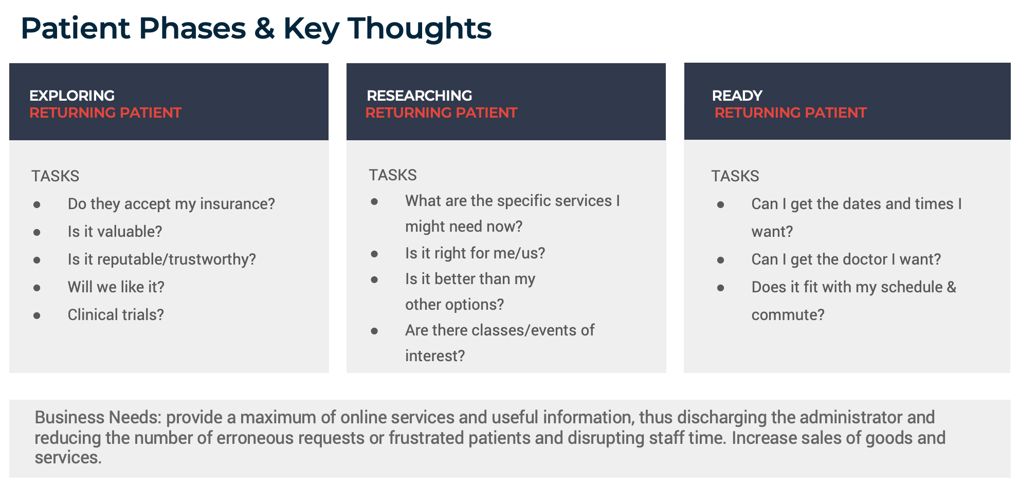
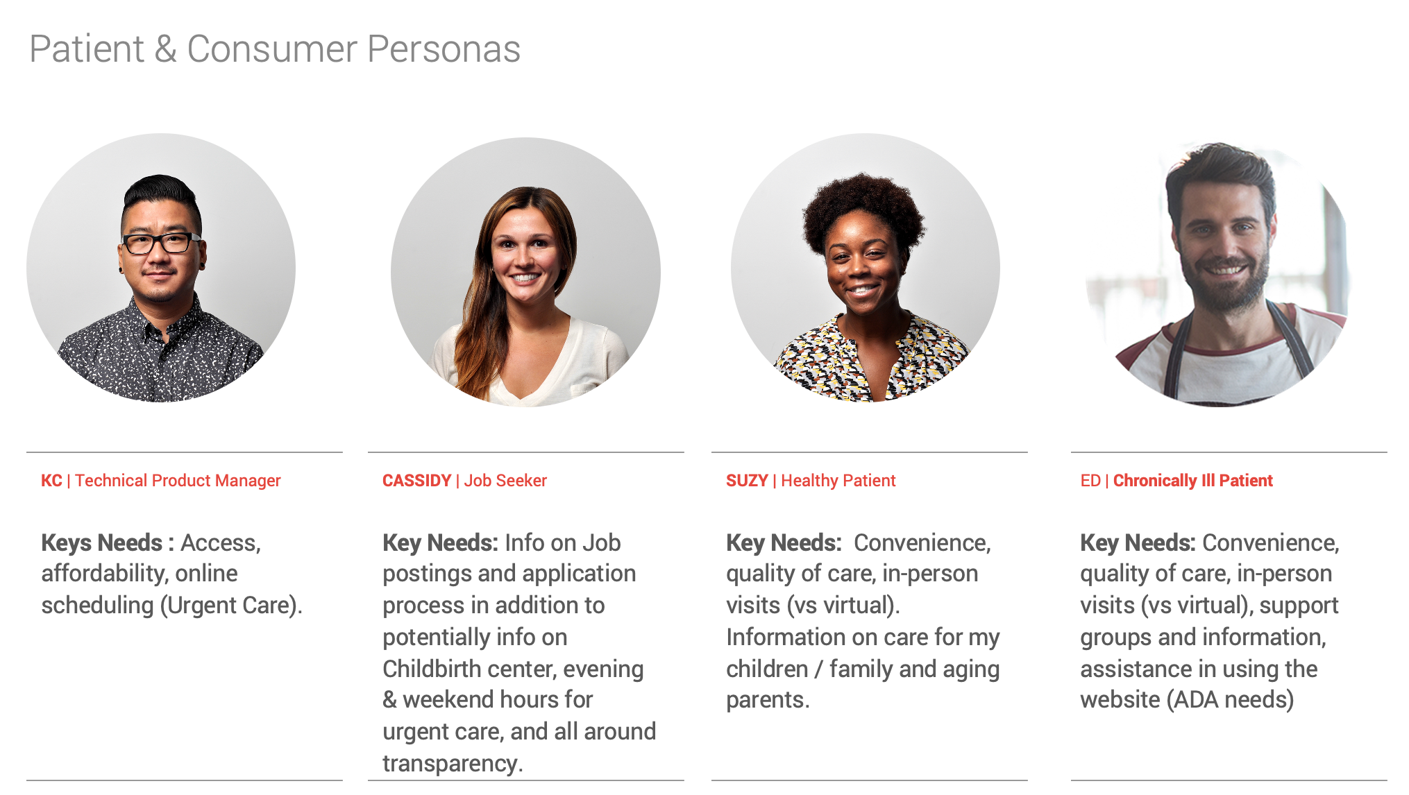
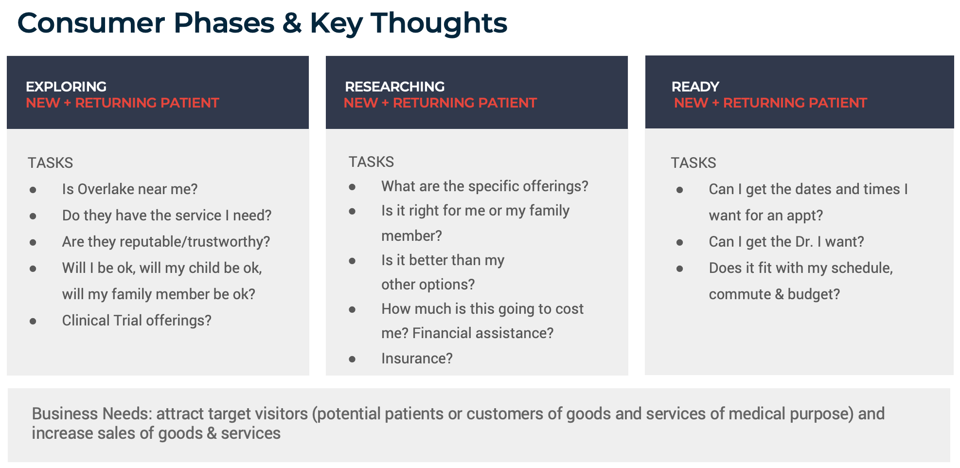
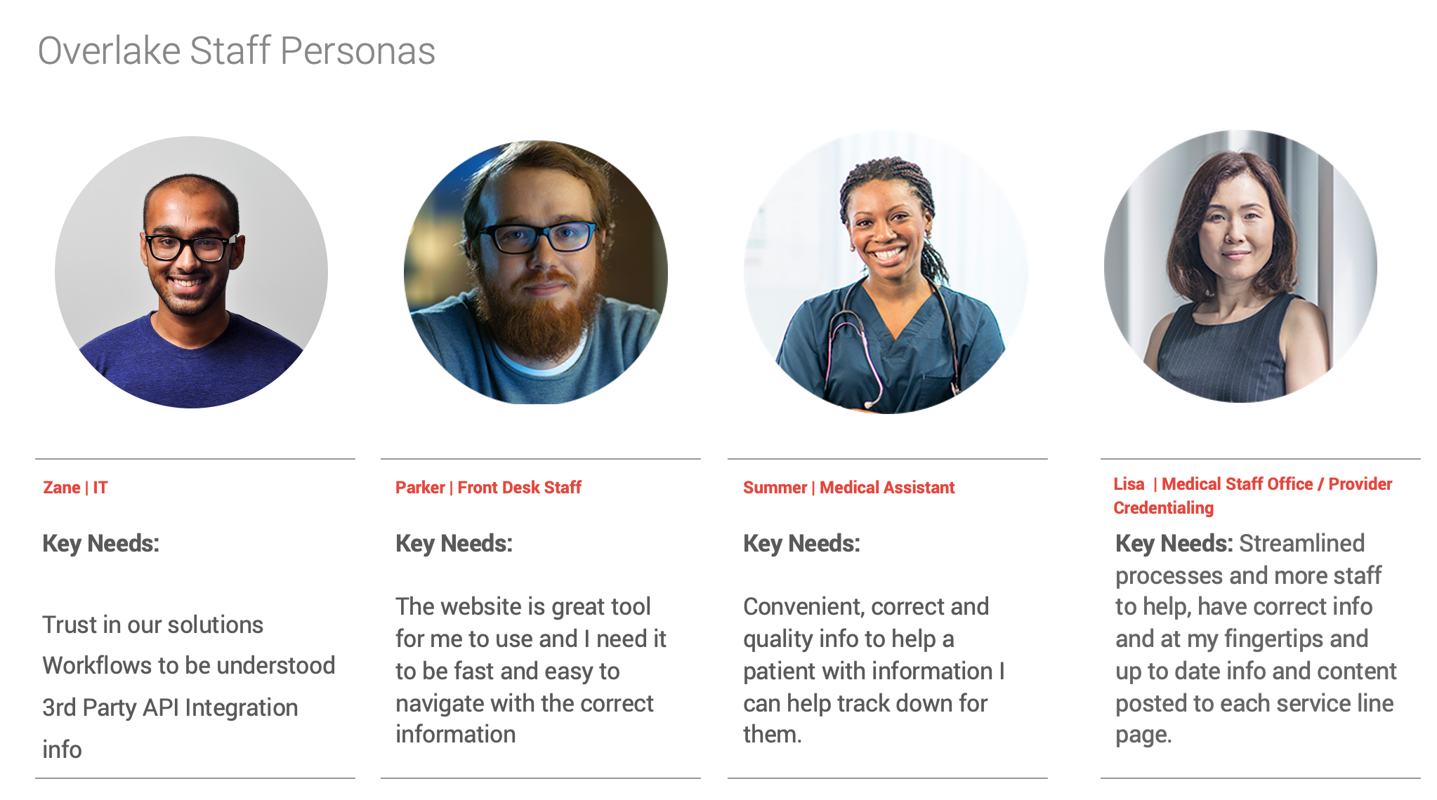
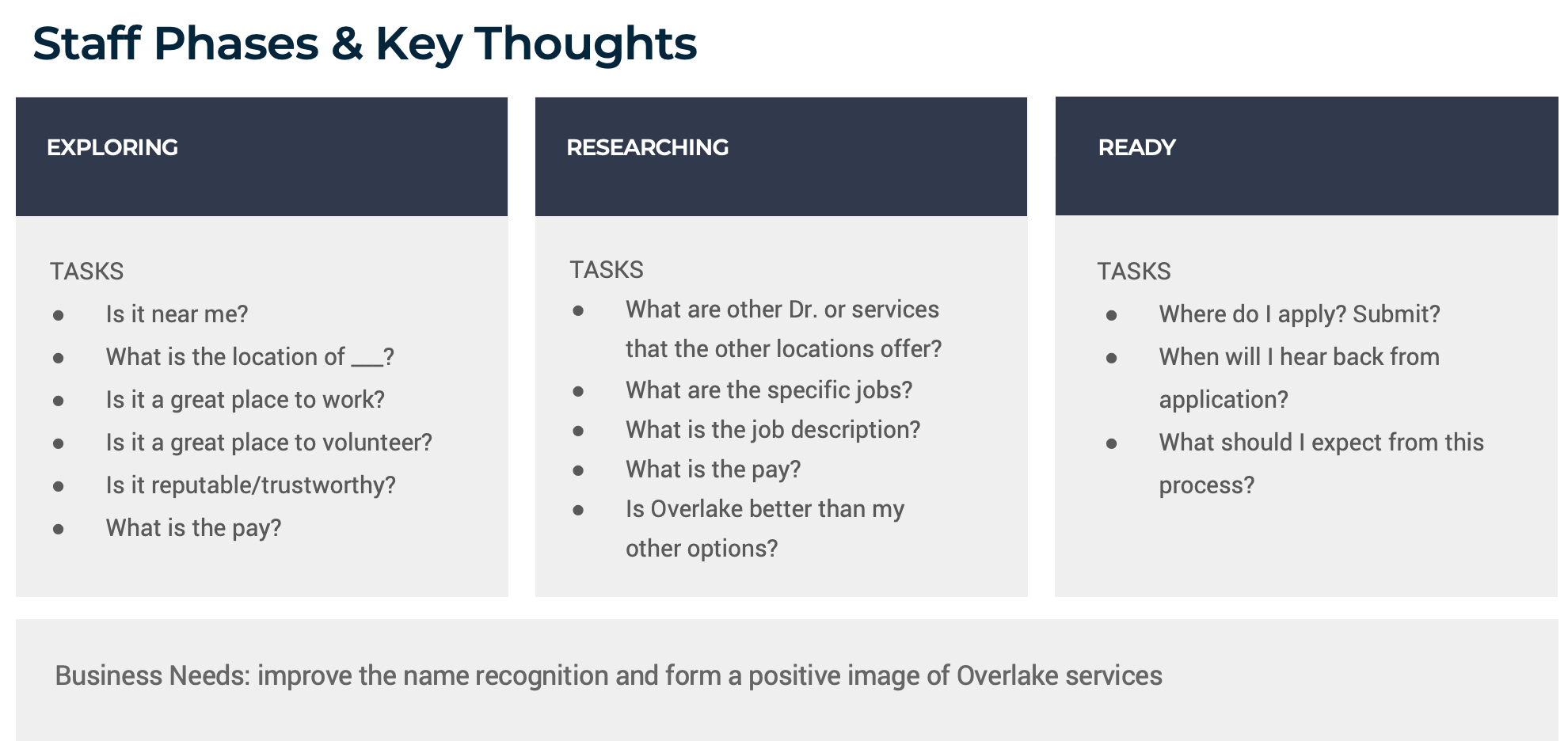
Discovery: Journey Mapping & Technology Requirements
We began journey mapping and persona development exercises to better understand our primary audience segments. We explored the phases and key thoughts and developed personas for each group which you can view in the carousel below. These were outlined into two primarily focus areas:
Consumer Focused: Patients, both current and prospective; community, including current and potential donors.
Staff Focused: Current and future employees; employed and affiliated providers.
Simultaneously, we conducted an evaluation of the technology requirements, taking into account countless considerations and business requirements. We began by evaluating Drupal (the existing content management technology) against other options in the market. We ultimately decided to proceed forward with this platform due to budget available, including cost over time, and its robust customization and scalability options. From there, we dove in to multiple third-party application documentation, HIPAA-compliance requirements, web accessibility standards and more.
Define: Content Audit & IA
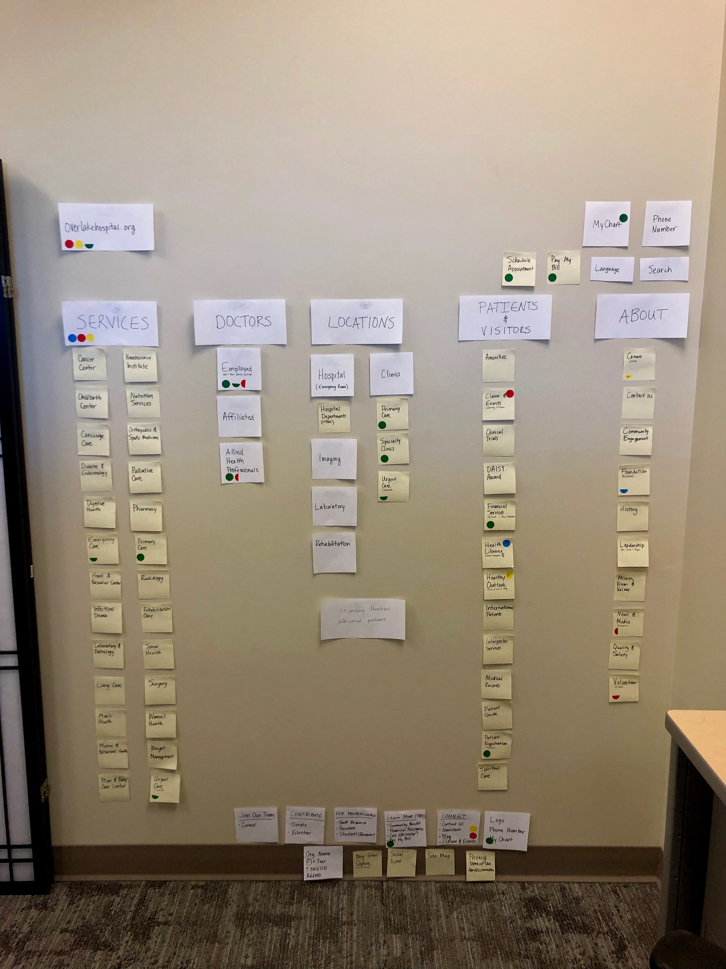
It’s no secret that healthcare websites typically have very complex content structures — this site was no exception. The site’s information architecture (IA) needed to be completely overhauled, include flexibility for custom content ordering, and house a comprehensive taxonomy strategy.
Where possible, we integrated a mix of quantitative and qualitative user research in our content exercises to quickly gather rich and actionable insights to support and inform the content roadmap. Our messaging hierarchy focused on:
Primary Message: Overlake is a healthcare authority that delivers engaging and useful information, quality care and superior service.
Secondary Message: We inspire our community to live a healthy lifestyle and empower them to take charge of their wellbeing.
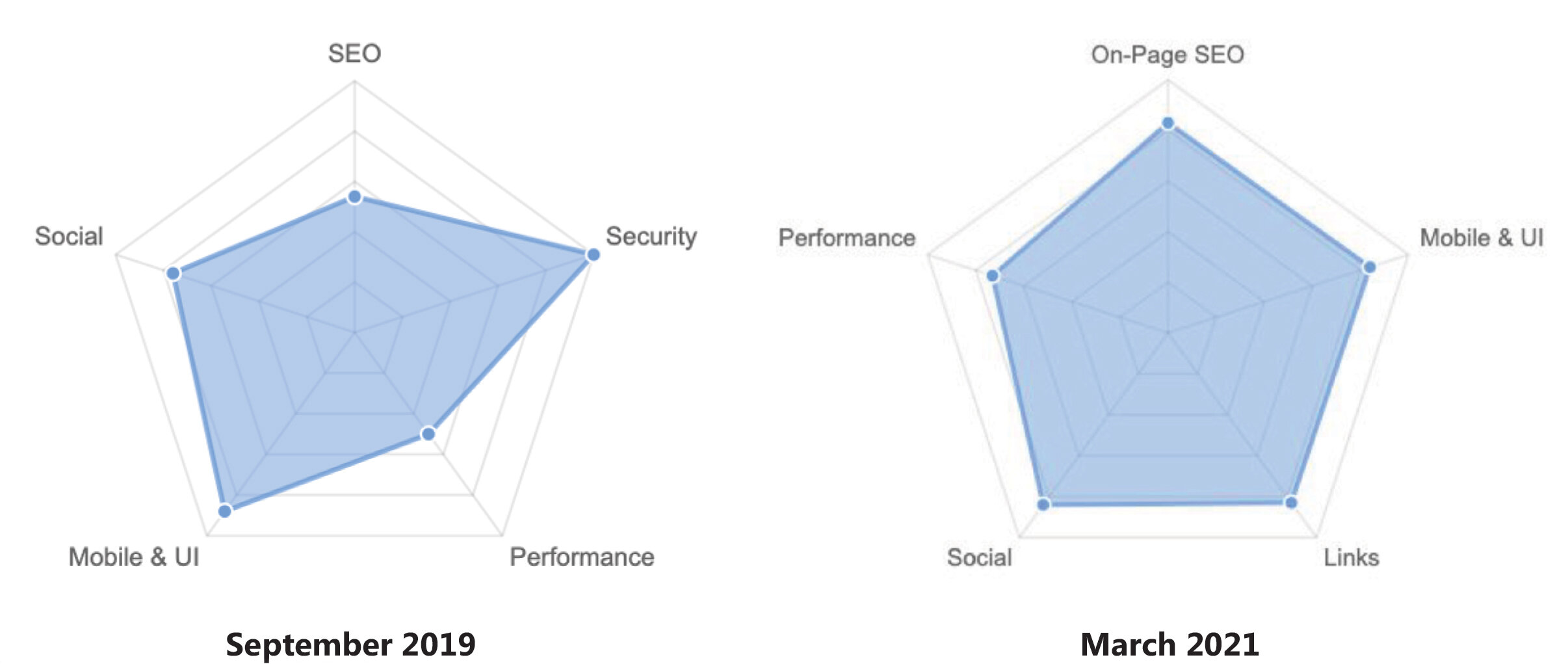
I used Google Analytics data to inform, guide and drive the approach to content strategy decisions. The resulted in a restructure of the content into five primary lanes: Doctors, Locations, Services, Visit and About. These lanes of content are supported by bulky secondary lanes of content including the: Blog, Careers, Giving, Classes & Events, and Newsroom.
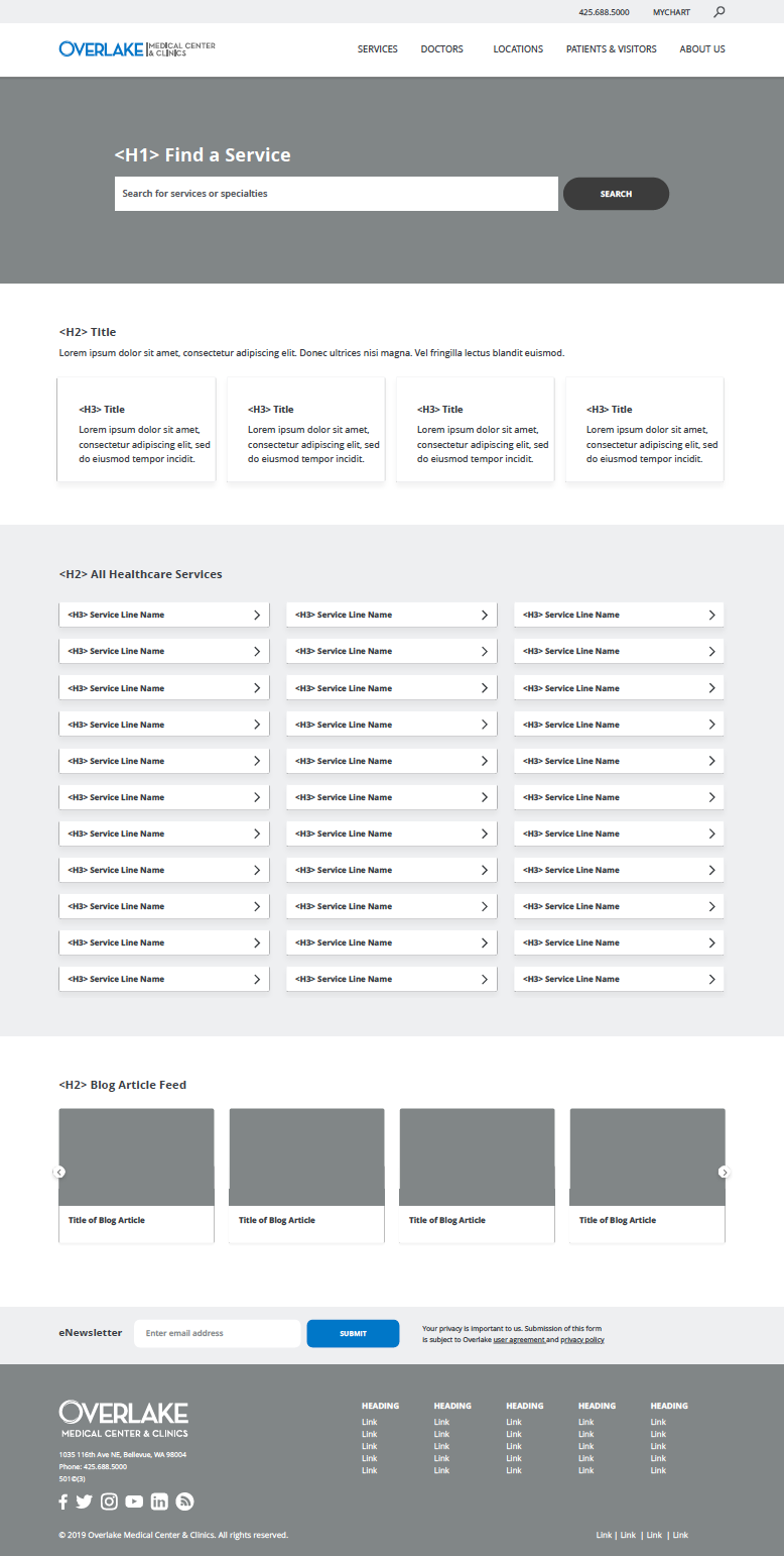
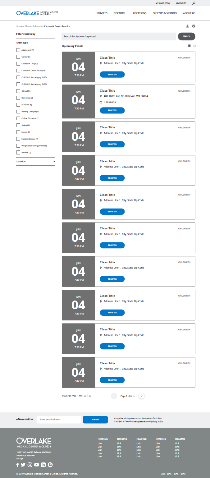
Build: Wireframes, New UX & Development
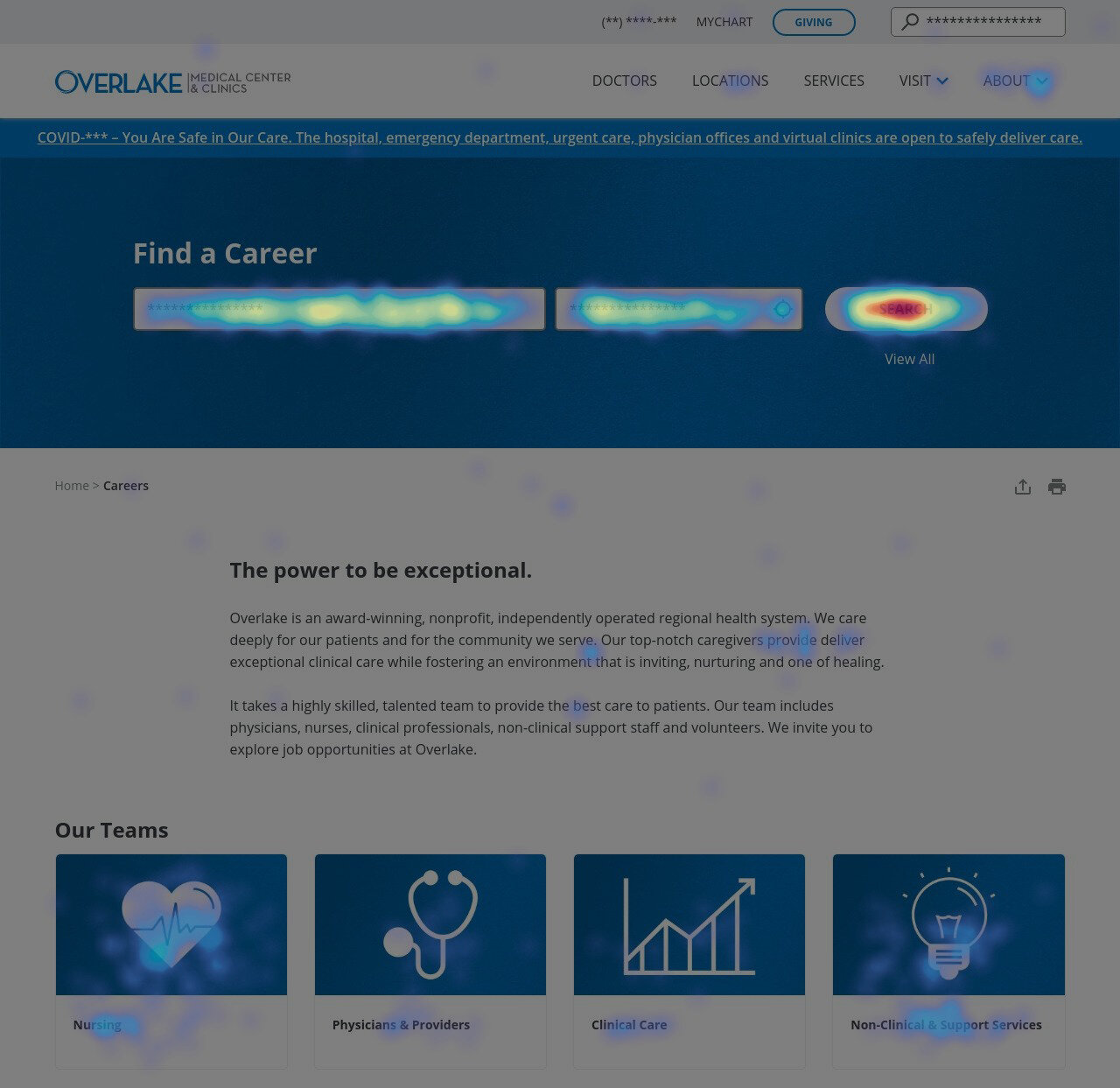
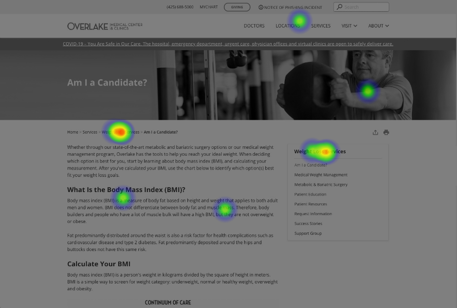
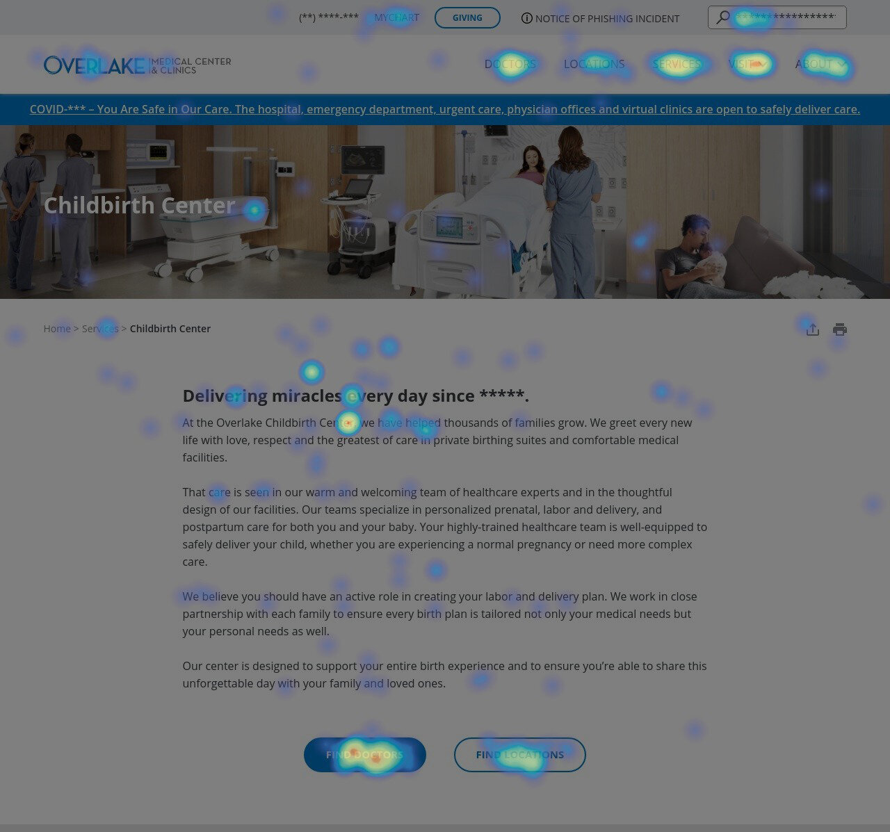
Once the new site map was established, we leaned heavily into designing a new visual design and UX for the site. We started by mapping patient journeys, utilizing heat maps to observe user behavior, and exploring opportunities and barriers across existing, new and competitive industry websites and digital touch points.
The user-informed design led us through three rounds of wireframe iterations—and countless mark-up documents—before we dove into development work. View the final high-fidelity styles by page and user interface style guide.
Low-Fidelity Wireframes


High-Fidelity Wireframes


Development began in January 2020 and ran for six months, each sprint being three-weeks. The agile development workflow allowed our agency partners to use development tools in their full capacity. In tandem with development, during this time we also migrated 3,000+ pages of content and mapped countless new fields into a new content management structure.
Results
The website launched on June 17, 2020 and was completed on time and on budget. Following launch, the refreshed website has simplified and tailored the experience for our intended audiences, but has also helped us achieve some significant milestones. Highlights include:
92% increase in website traffic year-over-year.
Back-end optimizations that resulted in an improved workflow for content owners.
Achieved a content architecture that was built to support a nested, “parent” / “child” navigation structure.
Functioning and easy search capabilities.
Achieved success criteria for ADA/A11Y web accessibility (WCAG 2.1 A/AA).
Supported owned audience efforts by featuring relevant blog articles and patient stories within service line content.
Amplified community education resources by connecting relevant classes as a primary call to action.
Testing & Optimizing
Through a combination of Google Analytics and multiple user testing products—Usability Hub, Optimal Workshop and HotJar—we continued to observe behavior analytics and review experience insights. Leaning into these tools greatly aided in our understanding of what was working and what wasn’t. Our hypothesis around simple navigation, prominent CTAs and leading with search bars on top-level landing pages was working, and very well at that.
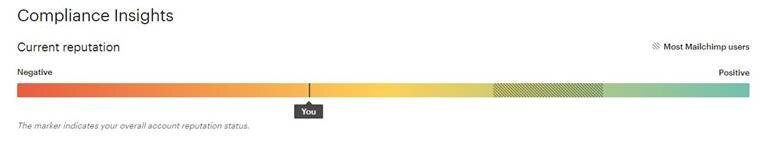
Bonus: Transactional Email Compliance
When I first joined the team, one of the primary concerns in the digital space was that e-Newsletters would end up in the recipients spam box more often than not. I worked with our agency partners to implement transactional email to ensure that the domain was validated as an authorized senders. After two years of slow but steady progress, it’s been such a blast to see the reputation soar to the very top of the scale.
January 2019
January 2021
